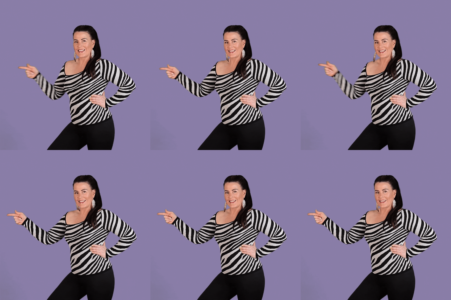
In this Yoüverlay you are pointing to the side twice to draw attention to something. 👈👈
You can change it up by either pointing casually, or urgently to change the meaning.
How to use this Yoüverlay in your marketing graphics
The ‘Point twice to the side’ pose can be creatively used on Instagram by having the individual point towards a text overlay that highlights a key message or call-to-action, such as “Swipe for more tips!” or “Check out the link in bio!” This can be enhanced with graphical elements like arrows or bursts in Canva to draw further attention. Potential captions could include “Double the points, double the value! Swipe to see what’s next! #ContentCreator #BrandPersonality #SwipeRight” or “Pointing you in the right direction! Click the link in bio for more. #Direct #Confident #Guiding.”
On a website’s home page, this pose can be used to direct visitors’ attention to a key feature or announcement, such as a new product launch or a special offer. The image can be paired with a text overlay like “Discover our latest collection” or “Join our community today!” Graphical elements like a spotlight effect or a bold border can be added in Canva to make the message stand out.
For a sales page, the pose can be used to highlight a limited-time offer or a unique selling proposition. The individual can point towards a text overlay that reads “Exclusive Offer: 20% Off Today Only!” or “Why Choose Us? Find Out Below.” Adding graphical elements like a countdown timer or a starburst can enhance the urgency and appeal.
On a product page, the pose can be used to draw attention to a product’s key features or benefits. The individual can point towards a text overlay that says “Top Features” or “Customer Favorites.” Graphical elements like checkmarks or icons can be added in Canva to visually break down the information.
For an ‘about us’ page, the pose can be used to highlight the company’s mission statement or core values. The individual can point towards a text overlay that reads “Our Mission” or “What We Stand For.” Adding graphical elements like a heart or a handshake icon can emphasize the message.
In a blog post, the pose can be used to draw attention to a key takeaway or a call-to-action at the end of the post. The individual can point towards a text overlay that says “Key Takeaway” or “Join the Conversation.” Graphical elements like a speech bubble or a lightbulb icon can be added in Canva to make the message more engaging.

