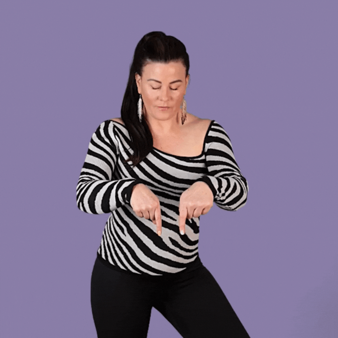
In this Yoüverlay you are looking down and pointing down repeatedly with two index fingers. 👇👇👀
You can change it up by either pointing casually, or urgently to change the meaning.
How to use this Yoüverlay in your marketing graphics
The ‘Looking and pointing down with two hands’ pose can be creatively used on Instagram posts by overlaying text or graphical elements in Canva to draw attention to a call-to-action or important information. For example, a content creator could use this pose to highlight a new blog post or product launch, with text such as “Check this out!” or “Don’t miss this!” placed below the pointing fingers. Potential captions could include “Exciting news below! #NewPost #MustSee” or “Swipe up to discover more! #NewProduct #Innovative”. Relevant hashtags might be #ContentCreator, #BrandPersonality, and #AttentionGrabber.
On a website’s home page, this pose can be used to direct visitors to a key section, such as a featured product or a special offer. The image could be placed above a button or link with text like “Explore our latest collection” or “Learn more about our services”. This visual cue helps guide users’ attention and encourages interaction.
For a sales page, the pose can emphasize a limited-time offer or a special discount. The image could be accompanied by text such as “Limited time offer below!” or “Exclusive deal just for you!” This approach can create a sense of urgency and entice visitors to take action.
On a product page, the pose can highlight specific features or benefits of the product. Text overlays might include “See the details below” or “Discover what makes this product unique”. This helps to draw attention to important information and enhance the user experience.
For an ‘about us’ page, the pose can be used to direct attention to the team members or the company’s mission statement. Text such as “Meet our team” or “Learn about our journey” can be placed below the pointing fingers, making the page more engaging and informative.
In a blog post, the pose can be used to highlight key takeaways or important points. Text overlays like “Key insights below” or “Don’t miss this tip” can help readers focus on the most valuable content. This visual element can make the blog post more dynamic and reader-friendly.

