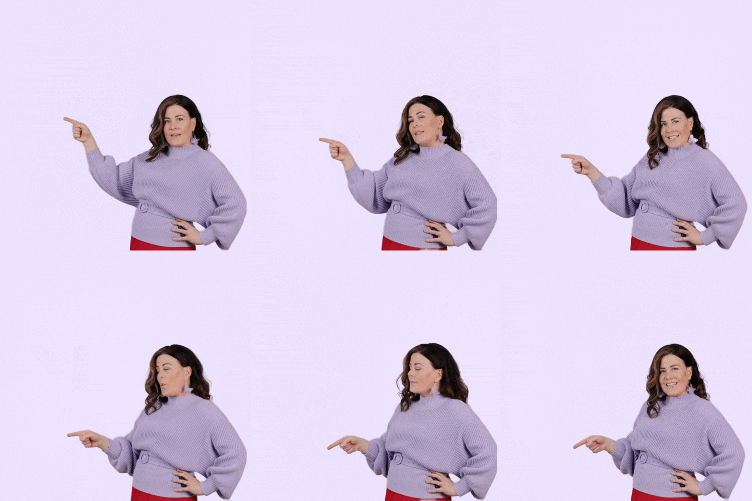
In this Yoüverlay you are turned to the side with your hand on your waist, pointing at 5 things. Starting high and ending low, at regular intervals. 5️⃣👈
You can change it up by adjusting the length of time you point at each level, depending on what you’re pointing at – one word or ten? A picture? Something thought provoking? Nod or shake your head.
How to use this Yoüverlay in your marketing graphics
For Instagram posts, the ‘Pointing at 5 things to the side’ pose can be creatively used to highlight key features or benefits of a product or service. For example, a content creator could point at five text overlays listing the top benefits of their latest offering, with a caption like “Discover the top 5 reasons why our product is a game-changer! #ProductBenefits #Top5 #GameChanger”. Relevant hashtags could include #BrandPersonality, #ContentCreator, and #InstaBusiness.
On a website’s home page, this pose can be used to draw attention to the main sections or features of the site. The individual could point at five icons or text blocks representing different sections like “About Us,” “Services,” “Testimonials,” “Blog,” and “Contact.” This visual guide helps visitors navigate the site easily and can be accompanied by a tagline such as “Explore what we offer” to enhance user experience.
For a sales page, the pose can be utilized to emphasize the steps of a purchasing process or the unique selling points of a product. The individual could point at five steps or features, with text overlays like “Step 1: Choose Your Plan,” “Step 2: Customize,” “Step 3: Checkout,” “Step 4: Delivery,” and “Step 5: Enjoy.” This methodical presentation aligns with the logical and explanatory brand personality, making the process clear and straightforward for potential customers.
On a product page, the pose can highlight the top five features or benefits of the product. The individual could point at text overlays or icons representing these features, such as “Durability,” “Affordability,” “Eco-Friendly,” “User-Friendly,” and “Innovative Design.” This visual representation can be paired with a brief description of each feature, making it easy for customers to understand the product’s value.
For an ‘About Us’ page, the pose can be used to introduce the core values or mission statements of the company. The individual could point at five text overlays that read “Integrity,” “Innovation,” “Customer Focus,” “Sustainability,” and “Excellence.” This approach not only draws attention to the company’s values but also aligns with the candid and straightforward brand personality.
In a blog post, the pose can be used to break down complex information into five key points or steps. For instance, in a post about “How to Boost Your Social Media Presence,” the individual could point at five text overlays with tips like “Engage with Followers,” “Post Consistently,” “Use Hashtags,” “Analyze Performance,” and “Collaborate with Influencers.” This visual aid makes the content more engaging and easier to digest for readers.

