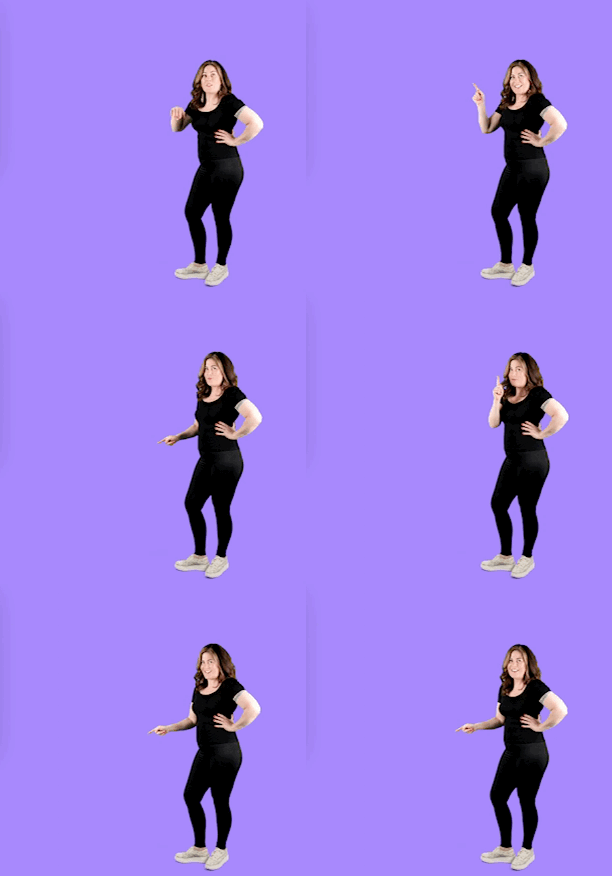
In this Yoüverlay you are Mouthing the word and using your hands to indicate ‘stop’ then pointing to 3-5 things to the side, from top to bottom, then shaking your head. Then point to the same 3-5 points while nodding. ✋👉
You can point to any number of areas of space to your side, which is where you can add text overlays into your graphic design – just be sure to point to the same number of ‘do this instead’s as people like symmetry!
How to use this Yoüverlay in your marketing graphics
On Instagram, the ‘Stop doing this’ pose can be creatively used by overlaying text on the image in Canva, such as “Stop Wasting Time on These Mistakes” with arrows pointing to common pitfalls in your niche. Potential captions could include “Let’s get real about what’s holding you back! #StopTheMistakes #BrandTips #BeYourBestSelf” to engage followers. Relevant hashtags might be #PersonalBranding, #ContentCreator, and #Inspiration.
On a website’s home page, this pose can draw immediate attention to key messages. For example, overlay text like “Stop Doing This, Start Succeeding” with a list of common errors and their solutions. This can be paired with a call-to-action button like “Learn More” to guide visitors deeper into the site.
For a sales page, use the pose to highlight common mistakes that your product or service can solve. Overlay text such as “Stop Struggling With These Issues” and list the problems, then follow with “Our Solution” and the benefits of your offering. This visual can be a powerful motivator for potential customers.
On a product page, the pose can emphasize the unique selling points of your product. Use text overlays like “Stop Settling for Less” with a list of inferior alternatives, then “Choose the Best” pointing to your product features. This approach can help differentiate your product from competitors.
For an ‘about us’ page, the pose can be used to communicate your brand’s mission and values. Overlay text such as “Stop Accepting Mediocrity” with a list of what your brand stands against, followed by “Join Us in Excellence” to invite visitors to connect with your brand ethos.
In a blog post, the pose can introduce a listicle or educational content. Use text overlays like “Stop Making These 5 Mistakes” with each point listed, then “Here’s How to Fix Them” to guide readers through the content. This visual can make the blog post more engaging and shareable.

