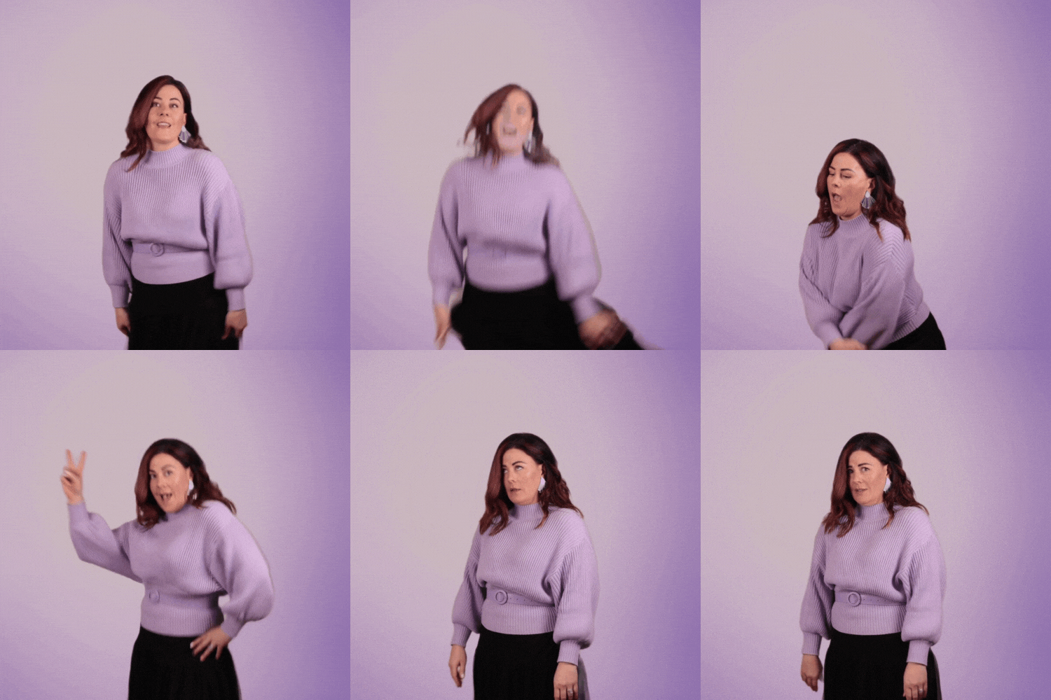
In this Yoüverlay you are performing silly dance moves then rolling your eyes, as if to indicate you are NOT going to dance. 💃🙄
You can be really ridiculous, if that’s your style, or perhaps more tentative, almost embarrassed.
How to use this Yoüverlay in your marketing graphics
On Instagram, the ‘Silly dancing’ pose can be creatively used to showcase a fun and relatable side of your brand. For instance, you could post a video of yourself doing silly dance moves with a text overlay saying, “When you realize it’s Monday again… #NotDancing #MondayBlues #SillyMe.” This approach not only engages your audience with humor but also humanizes your brand, making it more approachable and relatable.
On a website’s home page, the ‘Silly dancing’ pose can be used as a background image with a text overlay that reads, “Welcome to the fun side of [Your Brand Name].” This sets a playful and inviting tone right from the start, encouraging visitors to explore more. Adding graphical elements like confetti or musical notes in Canva can enhance the visual appeal and align with the brand’s personality.
For a sales page, you could use the ‘Silly dancing’ pose to break the ice and make the page more engaging. A caption like, “Why be serious when shopping can be fun? #ShopWithJoy #SillyShopping” can be added to the image. This not only grabs attention but also makes the shopping experience feel less formal and more enjoyable.
On a product page, the ‘Silly dancing’ pose can be used to highlight a product that is fun or quirky. For example, if you’re selling a novelty item, you could have a text overlay saying, “Get your groove on with our latest [Product Name]! #FunProducts #DanceWithUs.” This makes the product stand out and aligns with the playful vibe of your brand.
For an ‘about us’ page, the ‘Silly dancing’ pose can be used to show the candid and honest side of your team. A caption like, “Meet the team that dances to its own beat! #TeamSpirit #BehindTheScenes” can be added to the image. This not only introduces your team in a fun way but also builds a connection with your audience by showing the human side of your brand.
In a blog post, the ‘Silly dancing’ pose can be used to add a touch of humor and keep readers engaged. For example, in a post about work-life balance, you could include the image with a caption like, “Sometimes you just need to dance it out! #WorkLifeBalance #SillyMoments.” This makes the content more relatable and enjoyable to read.

