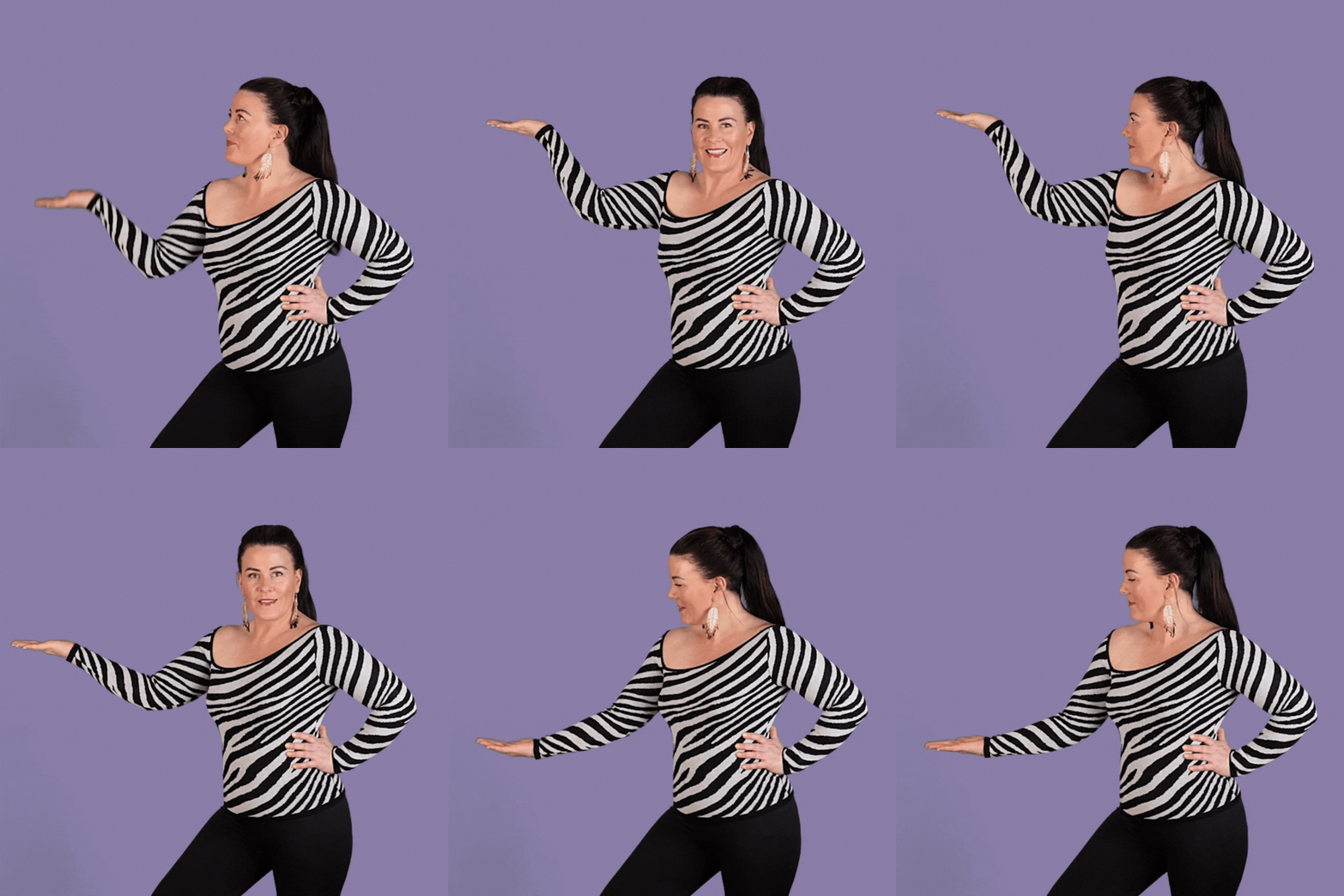
In this Yoüverlay you are presenting something to the side of you with your arm up high, then at mid height, then lower. 🫱👆
You can change it up by presenting casually, or gesture emphatically, or timing your movements to a beat, per second, per 3 seconds etc. As long as your accompanying messages might be.
How to use this Yoüverlay in your marketing graphics
For Instagram posts, the ‘Presenting to the side, 3 levels top to bottom’ pose can be creatively used to highlight key points or features of your brand or product. For instance, you can overlay text on each level of the pose using Canva, with the top level highlighting a unique selling point, the middle level showcasing a benefit, and the lower level presenting a call to action. A potential caption could be, “Discover the top benefits of our new product! Swipe to learn more. #BrandPersonality #ConfidenceInAction #ContentCreatorLife.”
On a website’s home page, this pose can be used to draw attention to different sections of the site. For example, the top level can introduce the brand, the middle level can highlight featured products or services, and the lower level can direct visitors to the latest blog posts or news. Graphical elements such as arrows or icons can be added in Canva to guide the viewer’s eye through the content.
For a sales page, the pose can be used to break down the steps of a purchasing process or to highlight different pricing tiers. Text overlays can be used to clearly label each step or tier, making it easy for potential customers to understand their options. This visual approach can make the sales page more engaging and easier to navigate.
On a product page, the pose can be used to showcase the features and benefits of a product. Each level of the pose can correspond to a different feature, with text overlays providing detailed descriptions. This can help to visually break up the information and make it more digestible for the viewer.
For an ‘about us’ page, the pose can be used to introduce different team members or to highlight the core values of the company. Text overlays can be used to provide brief bios or to describe the company’s mission and vision. This can help to create a more personal and engaging introduction to the team.
In a blog post, the pose can be used to visually break up the text and to highlight key points or takeaways. Text overlays can be used to emphasize important quotes or statistics, making the content more visually appealing and easier to read. This can help to keep readers engaged and to highlight the most important information.

